Most summer charity events, music festivals, sporting events, including our beloved Wimbledon are postponed until 2021. This leaves the public with a craving for all things summer. They want to engage in back garden barbecues. They want to lounge outside during long summer evenings while breathing in the scents of jasmine and honeysuckle. People are actively looking for how to recreate summer moments without being in big gatherings.
Becks Neale, Designer and Brand Consultant suggests incorporating summer colours into your charity brand designs and fundraising campaigns.
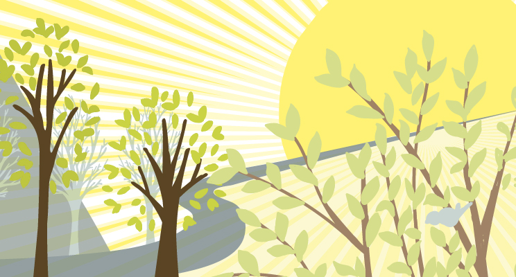
Use summer colours to shift people’s outlook
Arousing summer thoughts and moments in the minds of your donors, supporters, team, and volunteers is colossal. It lets the public know that even though we are under social gathering restrictions, life is going to be okay. It will resume. Your charity can be a reminder of this, a sense of hope and reassurance. You can be the symbol for all the feel good emotions associated with summer. Help restore people’s feelings of confidence about their future and to start to embrace the lifestyle and values they are searching for. You can achieve this by purposefully using summer colours in your branding.
Do not use jarring colours to represent summer emotions and moments
Summer is about picnics at the beach and dozing in the garden. It is about long, lazy days. It is about not having a schedule to maintain. A sense of freedom. Recreate this in the minds of your viewers and readers by choosing muted, subtle and elegant colours. Focus on cool greys and beiges, and pale pinks and yellows.
Apply fonts with an airiness feel
Using the right font compliments the summer psychology of your branding. Pick fonts that flow, almost look handwritten. Develop recreating a look and feel that has a medley of elegant, timeless and easy to read characteristics whilst emanating a sense of weightlessness.
When choosing the right summer colours and fonts for your design, ensure that it makes sense for your charity and tone of voice. Your campaigns, fundraising initiatives and content should work to amplify your brand story and purpose. Do not change it just for the sake of knowing you need to because it is summer. You want it to make your charity relevant and memorable. So make the summer colour psychology work for you and your messaging.
The transition to summer branding is an effortless one when you have an experienced and personal brand specialist working alongside you. I take a holistic approach to your branding, bringing you design to tell your story.
For more information on Becks and helpful advice and tips see www.becksneale.co.uk